How Does Your Media Product Represent Particular Social Groups?

Posted on

The social group that my magazine was aimed was predominantly ABC1, aged 16-24. The music that appears in my music magazine is portrayed to be mainstream yet more sophisticated, as was the intentions behind all other conventions of my magazine. The clothing and iconography of my music magazines is representative of the social group I am attempting to appeal to.

The connotations that the above photo carries are those of success and formality. The suit indicates that the model is formal and intelligent, which relates to the addressed audience. Other aspects, such as the hairstyle and stance represent that he’s not a hip-hop artist or a classical musician, but perhaps maybe a jazz musician or swing singer – which are the types of music that are perhaps listened to by an audience of a higher class.

Comparing this image above to a copy of Esquire (above)

Photoshoot For Contents Page – Amy

Posted on

Contact Sheet

Page 1 of photoshoot

The three above pages are contact sheets for the photoshoot I have taken in order to attain an image to use as the predominant feature of my contents page. Having a different model and theme offers more of a variety to readers and broadens the magazine’s appeal. I will select a sole image to edit and turn into my contents page’s main convention; based on its colour, proportions and general aesthetic qualities. The models and figures that appear in magazines, particularly music magazines, are not repetitive and there’s generally a diverse selection. For example, a musician that’s the subject of the main article may appear on the front cover of the magazine, and on the main aricle, but the contents page may feature a prominent image of another artist or celebrity. I have chosen to do just this, so these images are taken in aim of acquiring a striking and detailled image for my contents page.

Photoshoot for Magazine Front Cover & Double Page Spread – Daniel

Posted on

Six Contact Sheets for Magazine Photographs – Front Cover & Double Page Spread

The photo shoot above features the model originally contacted regarding the photo shoot, and these are the photographs I intend to use for my magazine. The photographs I took abide to the proposed style on the sketches I created, which were the male in the suit holding a microphone; except I was a lot more experimental than initially though, although this has produced some original and creative imagery that I feel will work nicely in my magazine.

The Selected Photos for My Magazine

All of the photos that I have highlighted as ‘chosen’ images are not images that may necessarily appear in my magazine, but are ones that are shortlisted to be placed in my magazine. When it comes to production; trial and error will be what dictates the images, and I will edit them further on selection. These photos all have the fundamental requirements for a good magazine image, such as good lighting and definite detail; all contributing to the creation of a striking image.

Research: My Intentions as a Result of my Research

Posted on

Carrying out my research has given me an insight to the music industry and the magazines that are based around that industry. By looking at front covers, contents pages and double page spreads; I have gained knowledge of how music magazines of different genres appeal to their target audiences. Like NME’s colourful and conjunct designs to appeal to their fast-paced rock-loving audiences, I plan to have a magazine that applies one hundred percent to my audience.

I have decided to create a music magazine has no bias towards different genres of music in the industry, much like Rolling Stone magazine. Rolling Stone is the magazine that I most admired whilst analysing music magazines and because of this, my magazine will be based heavily upon the successful conventions of Rolling Stone. What appealed to me about Rolling Stone that I plan to take into my own magazine is the simplicity and contextual quality of the magazine. Their focus on political matters and pop culture is another aspect I admired, but they are predominantly a music magazine, but have been known to frequently feature non-music related celebrities on their front cover. In creation of my magazine, obviously the front cover, contents page and double page spread will be music-orientated but I hope to add some advertising for other material such as  politics and film.

Example of female musicians appearing on Rolling Stone

Above you can see that Rolling Stone has quite a simple layout with more of a contextually quality photograph. All Rolling Stone centre-images are highly fashionable and placed upon a blank or very very faint background, somtimes even grey. Like the ones above, I want my centre-image to be very central and engaging with readers, and this can be done by having the model make a gesture of face the camera directly in the photograph.

*****

Rolling Stone's front covers featuring male stars

 The above three FCs are examples of Rolling Stone’s male models, and yet again feature prominently in the centre of the magazine. This is what I aim for in my magazine’s production. The typeface of the front cover almost ALWAYS matches the colours of the background and masthead, but are organised in a way which makes all of the conventions stand out. The masthead of Rolling Stone is typically red (as seen in the centre and right images), but the Brad Pitt cover has been made blue which is in response to his blue eyes – which are prominent in the cover.

Researching magazines has also led me to see that simplicity outshines a complex and concentrated design. Vibe, Rolling Stone, Q; these are all examples of magazines with simple colour codes and consistent conventions throughout.

Readership Profiles For Leading Magazines

Posted on

The readership profile of a magazine helps to establish the magazine’s circulation and rates. This helps increase productivity and  practicability rates in the industry and gives the creators an idea of what’s working and what’s not.

I have done some research into readership profiles and surveys and all top magazine brands feature information regarding readership on their websites.

‘Q’s website features a readership survey that conveys the readership and themes of the magazine:

Readership Survey taken from http://www.bauermedia.co.uk/Brands/Q/

Q’s readership survey shows that the “audience is composed of passionate, engaged and open minded music fans”, with 68% ABC1 and a gender ratio of 75/25% (M/F).

Rolling Stone magazine’s website also featured a readership profile of a lot more detail:

Readership Profile of Rolling Stone Magazine Rolling Stone magazine gives much more thorough information in their readership profile; giving information such as the ethnicity, value of their home, no. of children, average income and age of their average readership. This sort of readership information makes it much, much easier to create a magazine that’s perfectly shaped and moulded to the benefit of those that will be reading it – thus making it a more successful and profitable magazine.

Evaluation Question 1: In what ways does your music magazine use, develop or challenge forms and conventions of real music magazines?

Posted on
Evaluation Question 1: In what ways does your music magazine use, develop or challenge forms and conventions of real music magazines?

Everything in the world is derived from some form of inspiration. The study of multiple music magazines that are right at the top of the industry, such as Q, Vibe and Rolling Stone, enabled me to borrow, become inspired by, and challenge their conventions. It allowed me to notice the positives and negatives of each style of magazine; whether it be a simply laid-out magazine such as ‘Q’, or a more complex magazine design such as ‘Esquire’ or ‘Rolling Stone’.

Examples of conventions and forms that were initially inspired by top-of-the-industry magazines are seen throughout the production of my magazine. For example, my contents page was based heavily upon a ‘Q’ contents page regarding form and composition of the conventions.

You can see above the parallelism between the two contents pages. The juxtaposition of the images, the usage of graphics containing the sub-headings ‘features’ and ‘monthly’. They are very similar, indeed.

Another aspect of my magazine production that was inspired by current magazines’ forms and conventions was my masthead on my front cover. 

The gallery above portrays firstly, my masthead design ‘Maestro’, and two copies of Esquire’s masthead. You can see on these images that my ‘The Music Issue’ was inspired my Esquire’s ‘Music Issue’ seen above. You can also see that the fundamental qualities of the mastheads are similar, such as the bold, stylist font that’s laid over quite a bland background colour. My masthead’s white shadow is also inspired by the majority of Esquire’s mastheads featuring a shadow that’s a more luminous colour than the actual colour of the masthead. Eg. black and white.

When comparing my double page spread to the one of Q magazine, you can see clear similarities between the two.

This slideshow requires JavaScript.

You can see many similarities between the two double page spreads, perhaps the most obvious two being the apparent red letter opposite a black and white photograph. The reason I copied this is predominantly because the image hit me immediately when researching magazines, so the logic was that if it had that much of an impact on me; it would have an equally as great impact on other readers.

Plans For Magazine Production

Posted on

The production of magazine pages requires thorough planning to ensure that in the time given, the produced work can be of the highest quality. I have mocked up some basic plans that portray the proposed and intended layout of my magazine pages, that display the depth of the conventions and the intended proportions.

Plan for Front Cover

plan for front cover

Magazine Production: Contents

Production of Double Page Spread

The first step that I took in creating my double-page spread was selecting the photograph that I was going to use. I transferred this image to Adobe photoshop which is where I edited the image to make for a more appealing photograph.

I wanted the image to be black and white, much like the image of Lady Gaga featured in Q magazine’s double page spread (below).

Lady Gaga image

I did this because I felt that it created a more interesting and original image. It adds to the intended simplicity if my magazine; opposing the typically seen bright and vivid colours.

After deducting the colour from my photograph, I then had to make the black and white more prominent in the image. I did this by editing the brightness and the contrast of the image by going image > adjustments > brightness and contrast. I moved the arrows up and down the spectrum until I found the right tone and contrast that I thought made the image more striking without being too bright or too dark.

(Editing the contrast of the image)

After editing the image to look equally as appealing as the image that appeared in Q magazine, I had to lay the image on a double page spread-proportioned page in order to continue the process of my DPS.

At this stage of production, I had to place the image on an A3-sized image that had a high resolution (to make for a better quality page). After placing the image on an off-white A3 page, I had to align it to the left-hand page, as this was the page that I wanted to feature a full-sized image on. The next stage was to place something on the opposite page.

After placing the left-hand image on the right side of the page, I inserted the page number in a black font that's the same font as the masthead font. This is for consistency purposes and makes for a good magazine. I also inserted a separator (the white line) that will sit between the '23' and the words 'main feature'. This is a frequently seen feature in magazines and I think it looks modern and simplicity again benefits the magazines.

The following images are all examples of experimenting with different fonts to act as the background ‘D’ or ‘d’. I was judging them based on their consistency when regarding the recurrent theme of the magazine

My least favourite font is the bottom ‘Disco’ font, as it doesn’t fit in with the theme and I personally just don’t like it. The font that I prefer is the one coloured in red in the selection above, as it’s consistency within the theme and it makes for a more impacting image.

Above is the insertion of the capital letter that is going to appear as the first letter of the article’s sub-heading. I have chosen to make it the same font (Lobster) as the front cover’s masthead, as this is the theme’s font of my magazine – so I must try to keep it consistent wherever possible. Here, the juxtaposition of the red ‘D’ opposite a black & white photograph helps to illuminate both conventions of this double page spread. The page number that I inserted on the bottom corner of the bottom left, I have also inserted opposite on the right-hand side. I have also used the font ‘Lobster’ here.


As you can see above, I have written the sub-heading which is actually more of a heading, as there’s no other heading that’s above it. This is used to briefly summarise the article that follows, so that the readers can become more intrigued and interested by the article. Now that I had started developing the text by making a text box and inserting text that isn’t related to the article, but is a sample text that I found online, which I used purely for time convenience purposes.

I would now have to duplicate the text and position it below the incumbent text so that it becomes a full page of text.

I have duplicated the text here, but I have not yet aligned the bottom paragraphs with the top ones. As the text has been duplicated, A white background has appeared behind the bottom paragraphs - this requires me to change the 'normal' setting (below 'layers' tab) to 'multiply', which filters the white our of any layer it's applied to. Here, I also have to re-align the bottom paragraphs.

Now the entire ‘D’ is visible and I have aligned the text accordingly to the proportions of the image. In order to also compliment the proportions of the image, I have placed measure lines between the bottom of the article and the page no. and between the sub-heading and the article introduction. I have done this to add to the style and look of the double page spread, and it also adds to the consistency of the colour scheme. It was nearing completion.

The above image is what I deem to be my completed double page spread.

Production of Magazine Front Cover

Producing my magazine’s front cover involved a lot of inspiration from other magazines in the industry and also took a lot of digital manipulation.

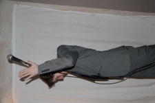
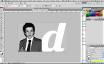
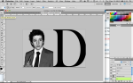
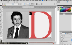
The first step that I took in creating my front cover was selecting the image for it, and moving that into Adobe Photoshop CS5:

Application used for creation of my magazine's front cover

I first created a copy of the background layer that is the image. I did this to make a foundation which would mean mistakes would not have as serious consequences, as you have the same image beneath the above one. This was just as a precaution. It was done by right-clicking the ‘Background’ layer, and selecting ‘duplicate layer’.

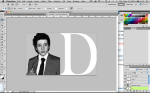
Step 1: Placing the image in the application

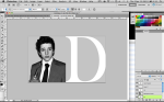
After the layer was duplicated, the next step was to make the image more appealing and striking to readers. So a bit of tweaking was needed.

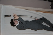
Image now edited and background copy's been removed

Comparing the above image to the original, you can see the difference that the adjustment has made.

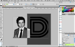
As the model’s face is quite blemished, further editing was required in order to make the image more attractive to readers. The stop I took was first selecting the spot healing tool:

Highlighting the 'spot healing tool'

The spot healing tool allows the photograph’s blemishes to be rid of without altering the foundations of that image. I decided to use this across all areas of the image in order to create a more perfect image.

When comparing this image to the one above; you can see the difference that the spot healing tool has made. (taken from final product)

After correcting any blemishes that the photo may have had, it was ready to be turned into a front cover, by firstly adding the masthead that I had chosen.

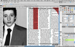
Chosen font and magazine title being produced in Photoshop.

This step involved opening a new Photoshop document and typing out my chosen title (Maestro) in my selected font (‘Lobster 2.0’ from dafont.com). Firstly, I chose the title based on it’s definition, which is as follows:

Definition of Maestro

I felt that this title suited the magazine’s theme, which is being an overseer or ‘master’ of music. Being such a music-based magazine, I wanted a masthead that was equally as music-orientated.

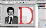
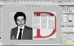
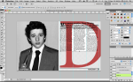
The next step in the production of my front cover was transferring the created masthead over to the centre-image of the magazine cover.

The above image shows the image of Daniel (the centre-image of the FC) that appeared earlier, and there’s a line that conveys the placement of the masthead that isn’t apparent because it’s behind the front layer. You can see that it’s behind another layer by observing the layer tab on the bottom left. The placement of my centre-image is good in my opinion, and the image is already quite striking and prominent.

The above step involved abolishing the background of the image, which would allow creating the other conventions of the magazine cover easier, as there would be no obstacle. This also allows for the creation of a one-coloured background, which I think will oblige to the colour scheme intended and will be an off-white colour.

What I have done here is I have transferred two copies of the masthead, one white and one black, and have placed the lowest layered copy (being the white) more placed to the right than the above black. This creates an inverted shadow of the masthead which makes the design much more original and stylish. Another convention in this image that’s been added is the line above and behind the masthead, ‘The Music Issue’, which almost acts as a tagline to the masthead.

This was inspired by the usage of the same idea on a cover of ‘Esquire’ magazine (below).

Esquire: The Genius Issue

I placed the ‘The Music Issue’ into my image by creating a new text layer on the toolbar on the left, and then placed it above the new, light grey background but below the masthead – as the masthead is more important and plays a more significant role in the cover.

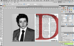
Initial 'final' front cover

After adding multiple other conventions, this is the front cover that I believed to have ended with. Audience feedback told me that this design was good and stylish, but far too crowded:

Comments from audiences showed that the image was seen as too crowded and conjunct

As the image was viewed as crowded by the majority, I decided I should take a little conventional weight out of the cover.

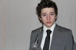
The above image shows the front cover, but with the left-hand side of the centre-image removed because it was too overwhelming when the considering the rest of the image. In addition to the removal of the text on the left-hand side, I have placed an additional image of another ‘artist’ with a bar across the bottom, but this was not the colour that was finally produced.

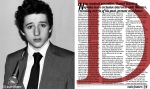
FINAL FRONT COVER AFTER EDITING

The above image is the final version of the magazine front cover. There are many differences between this and the previous image – one being the red banner across the bottom. I felt that this red banner is a convention that cooperates with the consistent colour scheme throughout the entirety of the magazine. This sort of consistency is what you would expect to see in a real music magazine from the top of the industry. I have included the banner at the bottom of the page fundamentally to attract readers to the magazine. To make the magazine more impacting to readers, I had the microphone that the model is holding overlap the banner at the front to make the cover more interesting. There are many conventions on this front cover derived and inspired by other magazines, such as measure lines and consistent fonts. I have used a measure line below the masthead to add to the stylishness of the cover, as well as including a tagline at the bottom regarding ‘Amy McDermott’ – a supposed featured article.