Monthly Archives: February 2012

Planning: Organization of Model for Photoshoot

In order to create a successful music magazine, I have to take a photo shoot to feature in my magazine. I have emailed the proposed models in request that they respond stating whether or not they are available for my magazine shoot.

Here is the e-mail I sent to the first model:

****

To: danielb@gmail.com; 27/02/2012

From: shaunbetchley@gmail.com

Subject: Media Photo Shoot

Hi Dan,

Just a quick question to find out whether or not you’re available for the photo shoot I have planned tomorrow evening (Tuesday 28th). If you are, could you be at mine at 6pm with a black suit and any coloured tie (preferably vivid) – and you will be staging as contemporary swing/alternative musician. Make your hair look quite Robert Pattinson-ish and be wide awake!

Thanks,

Shaun”

****

Response:

From: danielb@gmail.com; 27/02/12

To: shaunbetchley@gmail.com;

Subject: RE: Media Photo Shoot

Hey Shaun,

Yeah, alright. I’ll bring my microphone too for use as a prop. I’ll wash my hair before hand and you can do what you like with it.

Cheers and see you tomorrow”

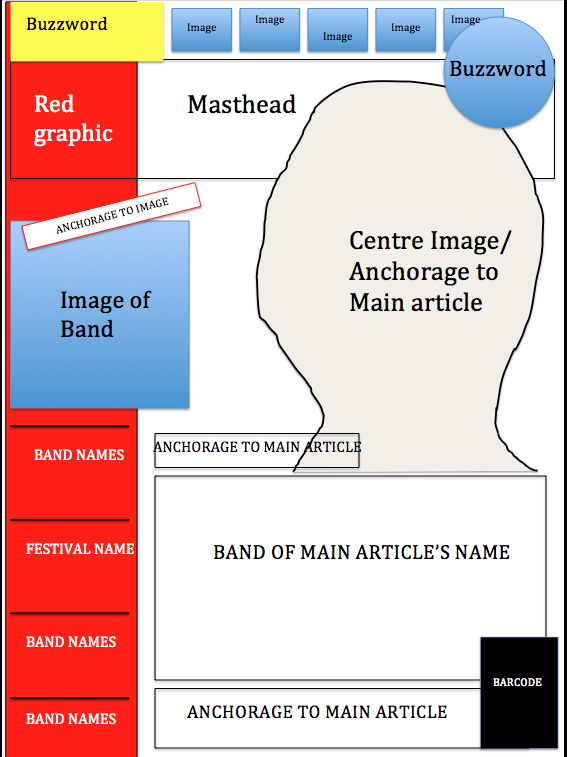
Existing Magazine Flat Plan

Magazine Flat Plan 1/2

 Second half of flat plan:

Magazine Flat Plan 2/2

 Front Cover Flat Plan for Kerrang!

FLAT PLAN for KERRANG

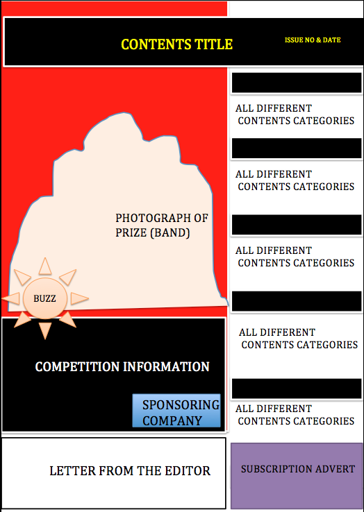
 Contents Page Flat Plan: Kerrang!

Contents Page Flat Plan for Kerrang!

Double Page Spread Flat Plan


Find Your Tribe Personality Test

My Result:

“You are Smart Urban! You want a good job and know that’s about looking presentable. You love the preppy look – the girls in Gossip Girl have great style. You hate anything uncouth – see fighting, drugs and Wetherspoons. You’re much more likely to be spotted at a cool club, or commuting to work.”

Most Apparent 'Tribes'

 The ‘Find Your Tribe’ quiz helps fit your personality to a stereotype, and these stereotypes are quite based on social and musical influences in a person. I will have to make sure that in my magazine, I appeal to the correct stereotypes, for example, in a rock magazine, you’ll want to appeal to the indie, mosher an emo stereotypes.

Magazine Research: Kerrang!

Kerrang! is a UK-based magazine devoted to rock music published by Bauer Media Group. It was first published on June 6, 1981 as a one-off supplement in the ‘Sounds’ newspaper. Named after the onomatopoeic word that derives from the sound made when playing a power chord on an electric guitar, Kerrang! was initially devoted to the new wave of british heavy metal and the rise of hard rock acts. In the early 2000s it became the best-selling British music magazine.

Front Cover of Kerrang! Magazine

 Above, the August 2010 version of Kerrang magazine carries a Union Jack theme. This theme encompasses a red, white and blue colour scheme and a centre-image featuring ‘top’ British artists in the rock genre. Being a rock magazine, this magazine cover would successfully appeal to the specific audiences as it has a modern and vivid design. This theme acts as anchorage towards the centre image and vice versa, as the union jacks that are being worn by the models match the colour scheme of red, white and blue – which appeals further to the British audience of the magazine.

 As always with Kerrang magazine across the very top is a thin bar with text about one of the articles within the magazine and in this case a small sticker shape with the Relentless Tour logo attached which relates to the text featured. Below this as always is the title of the magazine, the writing is a large size and covers the width of the page, not leaving any gaps. The text is very bold, strong and also has cracked and broken effects added to it, this creates a sense of aggresive and rebellious text, which relates to the music and articles which are featured in the Kerrang magazine, this text works very well as it is very bold and stands out from the background image. The text also contrasts with the background image, as the background image is a very bright blue and its an edited image of the sky, where as the Kerrang logo is black and very bold so it stands out very much from the background image. Also the heads of the three people shown on the front cover actually cover the bottom parts of the Kerrang logo, in some cases half the letter. This makes them stand out completely and showcases them as they are the main article and the main story within this issue. Kerrang is also able to cover parts of the title as fans of the metal, rock and alternative genres will almost all of the time know about Kerrang and its logo so the whole thing does not need to be shown to the audience.  In the very centre of the front cover is the main article subtitles, this is above all other images on the front cover making it the main attraction, it also covers the width of the page and is large, it consists of blocks in diagonal positions and red and blue writing inside matching the theme, this stands out to the viewer. There is also a splash above this which is slightly covered by the main headline, it is also red matching the colour scheme of the front cover. The text also consists of the same colours, it is also very conistent, bold and aggresive matching the theme of Kerang but still keeping the proffesional look. Below the left of the main article sub title is a cut out of two other people, these are seperate from the theme in the way they look and the colours that they are wearing, this seperates them and makes them stand out.

 To the right of the front cover, below the main article sub title is a splash, which consists of black textboxes and white writing, this is also similar to the main theme but slightly different, but matches the other image on the left bottom of the magazine. The colours and effects used in each of these stickers, splashes and tabs are very bold colours and all the text is the same, making a consistent and basic layout, but also looks very proffesional and matches the aggresive them of Kerrang. At the very bottom of the magazine there is a red block which also consists of a white arrow inside, this box matches the theme. In this box is all the other articles and aspects included in the magazine, the writing consists of black and white and uses the same different texts that are featured on other parts of the front cover. This front cover is contrary to typical Kerrang magazine covers, as the most prominent colours are black, white and sometimes yellow or another bright colour, but this unnatural theme matches the main article of the issue.

Kerrang! Contents Page Analysis

Kerrang! Contents Page

Magazine Research: Rolling Stone

Rolling Stone is a US-based magazine devoted to music, liberal politics, and popular culture that is published every two weeks. Rolling Stone was founded in San Francisco in 1967 by Jann Wenner, who is still editor and publisher, and music critic Ralph J. Gleeson.

Magazine Front Cover Analysis

Rolling Stone Magazine Cover

 Rolling Stone always features their trademark italic masthead where only the colour differs in each issue. The cover also generally features an engaging centre-image, here it being rap artist Lil Wayne. The white background allows for the masthead and centre-image to appear more illuminated, which engages readers more efficiently. As the magazine’s most prominent feature is the music (hence the title ‘Rolling Stone’), the cover story and apparent main article is based on Lil Wayne and the story ‘Lil Wayne Goes Rock’. This cover line is followed by an anchoring tagline ‘Rap’s Genius Changes His Game’. Each of the cover stories that are separated by a yellow rectangular piece of graphic are written in a bold, white font to stand out. Contrary to this: the date line, price, issue no. and website address that appear above the masthead are faded and very hard to see, as this is not a crucial convention in the magazine cover. Contrary to many magazines, despite this photograph’s bold, resounding appeal, the model (Lil Wayne) is not directly facing the audience, but I suppose this could intrigue audience. This photograph also acts as anchorage to the cover story, as it is all under the same topic/subject.

This magazine cover, despite the elicit style and colourful approach the designers have taken, is actually quite simplistic and is not too complex, and has a more organic aesthetic quality. A convention that conveys the magazine’s prestige and reputation is the cover line placed above the masthead in the top right-hand corner that states ‘The Bush Crimes – Inside the interior dept.’. This shows how recognisable the brand is and how established they are amongst audiences. Rolling Stone magazine’s design appeals to me personally and I think it’s a very simplistic yet elegant magazine cover. I like the simple yet well-communicated information, and I especially like the bold and italic masthead. I will take all of these positive aspects into the production of my own magazine.

Analysis of Rolling Stone Contents Page

Rolling Stone Magazine

Rolling Stone magazine features a vertical separation between images and body copy, with all of the featured imagery portraying different topics/subjects, which represent and appeals to the magazine’s wide demographic. The magazine’s main focus towards music is shown as two photographs are of music artists (MCR & Bruno Mars) and the bottom photograph is of Barack Obama (as the magazine traditionally contains political articles). On the right-hand side of the page, the contents are separated into ‘features’, ‘national affairs’ and ‘departments’. The dominant section is ‘features’ which would contain articles that appeal to a broader audience, and the ‘national affairs’ will be articles on american politics and the ‘departments’ are separated into subcategories which are ‘rock & roll’ and ‘reviews’ – and readers always love reviews. Each section of the contents page is separated by measures that are red, which abides to the recurrent colour scheme of the rest of the page. The titles of each section of the contents page are written in the red lettering, the same as the page references next to the article titles. The ‘contents’ title is placed in the centre of the splash inside a red rectangle and’s written in white lettering. This red rectangle features a date line and the magazine title below the word ‘contents’.

A small list features just below the review title about Kanye West’s new album ‘Dark Twisted Fantasy’ that gives page references in smaller, more insignificant writing about the less prominent topics in the magazine, films being one of them. This features in the magazine to appeal to a broader demographic and will give readers an insight to ALL aspects of society. Below this list, anchorage that refers to the front cover’s image informs the readers of the photographer and date on which the photograph was taken. This gives aspiring photographers or graphic designers the opportunity to research the photographer if the photo appeals to them. Below this reference, by-lines are apparent that show the designers and directors of the page for any design enthusiasts – so the magazine isn’t just for reading, it’s for admiring.

Rolling Stone Double Page Spread (DPS)

The immediate attraction point of this DPS is the sexually-orientated image on the right of Katy Perry, which is much more prominent than the seemingly blander body copy on the opposing page. The photograph is contrarily colourful in comparison to the body copy, which is in a neutral black and white theme. The centre of the splash on the body copy (main text) features the subject of the interview so it is a title almost, and this ‘title’ also features a pull quote taken verbatim from Katy Perry. The quote I am referring to is “I took mushrooms at a daft punk show” and “I had to throw myself into a shower fully clothed afterward”. This briefly teases the audience with the content of the article, and intrigues and enthuses them to read further. A drop-cap is seen just below this title which conveys that it’s a new paragraph, and the ‘A’ is in the same dark grey lettering as the main text body.

Double page spreads consist of much less that contents pages or front covers, but this is because there is a lot less information that needs to be conveyed. This DPS is only one story that needs portraying through words and images, so less images and more, but detailed, words are required to make this DPS successful. My favourite features of this DPS are the simplicity in the design, as it’s only three columns of small, traditional-styled text, with graphics atop the article that enclose the name ‘Katy Perry’ in a faint box to the left. Another component of this magazine that I think works well is the pastel-like colour of the photograph, and by pastel-like I mean not too saturated. This works well with the simple text-embodied page that opposes it, as neither page is too overwhelming or too bland.

I hope to borrow mostly from this DPS as it stands above the ones that I have studied so far. I cannot complain about this double page spread and its elegant simplicity stands far above the quality of the other magazines I have looked at. My magazine will not be a complex and highly concentrated magazine like NME or Vibe, but will be simplistic like Rolling Stone.

Research Into Magazine Institutions

Magazine Research: Uses and Gratifications Theory

One influential tradition in media research is referred to as ‘uses and gratifications’ (occasionally ‘needs and gratifications’). This approach focuses on why people use particular media rather than on content. In contrast to the concern of the ‘media effects’ tradition with ‘what media do to people’ (which assumes a homogeneous mass audience and a ‘hypodermic’ view of media), U & G can be seen as part of a broader trend amongst media researchers which is more concerned with ‘what people do with media’, allowing for a variety of responses and interpretations. However, some commentators have argued that gratifications could also be seen as effects: e.g. thrillers are likely to generate very similar responses amongst most viewers. And who could say that they never watch more TV than they had intended to? Watching TV helps to shape audience needs and expectations.

Most of the theories on media explained about the effects media had on people. It is the theory which explains of how people use media for their need and gratification. In other words we can say this theory states what people do with media rather than what media does to people. Also this theory is contradictory to the magic bullet theory which states the audience is passive. According to uses and gratification theory, it is not so people make use of the media for their specific needs. This theory can be said to have a user/audience-centered approach .Even for communication (say inter-personal) people refer to the media for the topic they discuss with themselves. They gain more knowledge and that is knowledge is got by using media for reference. There are several needs and gratification for people they are categorized into five categories.

  • Cognitive needs
  • Affective needs
  • Personal Integrative needs
  • Social Integrative needs
  • Tension free needs

Cognitive needs:

People use media for acquiring knowledge, information etc., Among the audience some of them have intellectual needs to acquire knowledge this is not common to all only certain people have their need, each person have a different need for e.g. quiz programs on TV, in order to acquire knowledge and information you will watch news to satisfy the need, search engines in the internet, they make use of these to gain more knowledge. Particularly for the internet search engine they can browse for any topic under the run with no time restriction.

Affective needs:

It includes all kinds of emotions, pleasure and other moods of the people. People use media like television to satisfy their emotional needs

The best example is people watch serials and if there is any emotional or sad scene means people used to cry.

Personal Integrative needs:

This is the self-esteem need. People use media to reassure their status, gain credibility and stabilize. so people watch TV and assure themselves that they have a status in society for e.g. people get to improve their status by watching media advertisements like jewelry ad , furniture’s ad and buy products, so the people change their life style and media helps them to do so.

Social Integrative needs:

It encompasses the need to socialize with family, friends and relations in the society. For social interaction now a days people do not seems to have social gathering in weekend, instead they do such social interaction using media like the social networking sites like my space, facebook, orkut etc to satisfy their need.

Another example is you may not watch the particular serial regularly but because your friend watching, you also start watching so that you have common topics for discussion.

Tension free needs:

People sometimes use the media as a means of escapism and to relieve from tension

For e.g. People tend to relax watching TV, listening to radio and for satisfying their need for entertainment there by relaxing from all the tension, people watch films, films on TV etc

Note: The needs are individual in nature, and how u satisfies the need is individualistic.

E.g.: That’s why some watch news to relax and some get more tension by watching news, Program is same but people use it for different needs.

Taking TV today, most people watch reality shows because

  • It is more realistic
  • For entertainment
  • Interesting
  • New concepts (different from other programs)
  • In a way you can participate
  • Controversy, people crying
  • Sensationalism

Criticism of Uses and gratification theory :

  • The uses and gratification theory does not consider the power of media
  • More audience-centered
  • Positive point of the uses and gratification theory is it focuses attention on individuals in the mass communication process.

How I Can Apply This To My Own Work

The Uses and Gratifications Theory can help me gain an insight to the needs and necessities of media and how audiences use and perceive it. A music magazine’s fundamental purpose would be entertainment with advertisements and information as secondary purposes. Magazine readers generally have cognitive needs as well as tension free needs; so a collaboration of the two wouldn’t be a bad idea. By this, I mean the integration of information and entertainment through conventions such as imagery and graphics.  Readers may feel that an artist in an article is applicable to their social class or ethnicity, or perhaps it’s popular amongst a group of friends so allows for a topic of discussion, thus satisfying social integrative needs.

I will bear this theory in mind when producing my magazine work; as it will remind me that magazines have purposes and supply information and satisfaction to consumers.

Magazine Audience Research: Questionnaire

In order to create a successful music magazine, you have to grasp an idea of who you’re appealing to and what they expect to find in a satisfactory magazine. I have constructed a questionnaire that in hope will give me an insight into what is looked for in a magazine, and what is and isn’t enjoyed in reading one.

The questions that I asked were as follows:

  1. How often do you purchase a music magazine?
  • On a weekly basis
  • On a fortnightly basis
  • On a monthly basis
  • Other (please specify): ____________

  1. What music magazines do you purchase most frequently?
  • NME
  • Kerrang!
  • Q
  • Mojo
  • The Fly
  • Clash
  • Classic FM
  • BBC Music (classical)
  • Other (please specify): ____________

  1. What feature(s) of a music magazine are you most interested in? (mark multiple if necessary)
  • Interviews
  • Reviews
  • Exclusive News
  • Gig information/advertising
  • Posters
  • Photography
  • Other (please specify): ____________

  1. How much are you usually happy to spend on a music magazine?
  • No cost (free)
  • £0.01-0.99
  • £1-1.99
  • £2-2.99
  • £3-3.99
  • £4+

  1. What genre of music are you mainly interested in?
  • Anything in the charts
  • Pop
  • Rock
  • Metal
  • Hip-hop/rap
  • R&B
  • Classical
  • Jazz/blues
  • World music
  • Other (please specify): ____________

  1. If any, which radio station do you choose to listen to?
  • Heart FM
  • Capital FM
  • BBC Radio 1
  • BBC Radio 2
  • Magic
  • Kiss 100
  • Absolute
  • Kerrang! Radio
  • NME Radio
  • Other (please specify): ____________

  1. In which way do you access your music files?
  • Paid music downloads (please specify source): ____________
  • Illegally downloaded MP3s
  • CD purchase
  • Live streaming
  • Other (please specify): ____________

  1. What urges you the most to buy a music magazine?
  • An appealing front cover
  • TV advertisements
  • Web advertisements
  • Posters
  • Other (please specify): ____________

Some of my included questions required some background research – question one required some knowledge of the dates and frequencies of which magazines are published. The given answers of ‘weekly’, ‘fortnightly’ and ‘monthly’ were the most apparent issue patterns for the majority of popular magazines, but I have given the ‘other’ option for the minority of different publishing patterns. Research was also required for other questions, for example, question three required research into the conventions of a typical magazine, but again giving the ‘other’ option for any dissimilar responses. Hopefully this questionnaire will give me an insight to what I must include in an ideal magazine.

Magazine Questionnaire Results

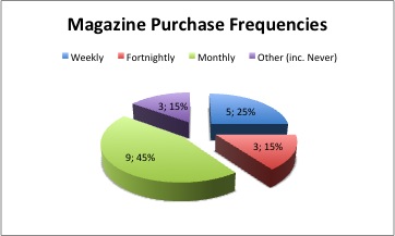
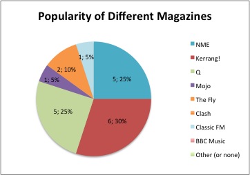
I conducted my questionnaire across twenty people and have tallied up the results into the most practical charts. The charts appear as follows:

Pie Chart Representation of Questionnaire Results

Answers from question one convey that forty-five percent of questioned people buy their magazines monthly, with only a quarter having weekly patterns, and below twenty percent buying a magazine fortnightly and the same percentile having some other purchase pattern or having never purchased a magazine. This will help me identify how to advertise my magazines publishing frequency.

Chart displaying percentiles of popular magazines from questionnaire results

 The results from question two conveys that ‘Kerrang!’ magazine is the most popular music magazine amongst 16-21 year olds (the age range of whom I asked), and it shows the classical, less modernly apparent music magazines are not so popular, with BBC Music only having one reader. Q, NME and Kerrang! dominated this data with ‘The Fly’ just behind, this may be perhaps it is a free magazine. The results of this question inform me of which magazines to use as inspiration when creating my own music magazine.

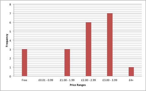
Results from question 4 - price ranges

 The chart above indicates that the £3.00-£3.99 price range is the most frequently paid amount for music magazines amongst the twenty people that were asked. This implies that I will have to research magazines in this price range to see what content is held and what makes them worth their money.

Pie Chart Conveying Why Consumers Buy Magazines


The chart above portrays the proportions of reasons why consumers purchase music magazines. Appealing front covers appeared the most as the response, with appealing content only being ten per cent behind. Conveyed here are the ways in which I should advertise or appeal to my audiences, and appealing front covers and contents were the highest responses.

Music Magazine Research: Vibe

“‘Vibe’ is a music and entertainment magazine founded by producer Quincy Jones. The publication predominantly features R&B and hip-hop music artists, actors and other entertainers. After shutting down production in Summer 2009, Vibe was purchased by the private equity investment fund InterMedia Partners and is now issued quarterly with double covers, with a larger online presence, aided by the Vibe LifeStyle Network, a group of entertainment/music websites under the Vibe brand. The magazine’s target demographic is predominantly young, urban followers of hip-hop culture.”Wikipedia, 2012.

Magazine Front Cover: Vibe
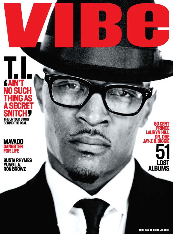
Front Cover of Vibe Magazine

At an instant, the masthead in cooperation with the centre-image create a bold and striking front cover. The contrast between the red, impacting masthead reading ‘VIBE’, and the greyscale-edited photograph of T.I enhance the impact on readers of both the components of this front cover. The graphology has been designed to portray the same colour scheme shown in the masthead and photograph, with the featured cover-lines being red and black – colours that hold connotations of danger and anger, which could represent the genre of music the magazine conveys. The cover-lines are supported by tag lines that briefly summarise the featured article, such as ‘T.I’ being the cover-line and the apparent featured article, and the anchorage text tagline beneath reading ‘Ain’t no such thing as a secret snitch’. This quote supports the article and more anchorage text below that tagline reads ‘the untold story behind the deal’. The photograph’s negative space has been utilised well by the designers as that’s where the text has been placed, thus not making the image too overwhelming. The masthead follows various typical magazine conventions by having similar logos to ‘Mojo’, ‘NME’ and ‘Q’, with the bold and resounding masthead (also red). Contrary to the likes of Rolling Stone Magazine, or Mojo, the masthead is layered above the centre image and is placed central to the splash, and this is because the magazine is much less known than Mojo or Q magazines, where the audience don’t need to directly read a logo/masthead/title. The masthead is also of a much brighter red than that of the cover-lines or any other conventions of the FC, because as they’re a smaller magazine, they want to publicise the title and the brand and make it recognisable.

The centre image covers a great percentage of the splash and has been taken straight on in a close up – which allows the observation of facial features and make direct eye-contact which engages audiences and perhaps intimidates them, which also links in with the angry graphology. This intimidating gesture also links in well with T.I’s persona in the music industry, as well as the publicity he received regarding a prison sentence near the time of the articles publishing. The black and white element of the picture adds to the sophistication of not only the magazine but also the model, along with the clothing he is wearing. The shirt, tie and hat combination gives T.I a classy look, which contrasts with the ‘gangster’ image that is partly associated with him. However, by adding casual glasses this shows that he is not all work and that he is also laid back, connoting that T.I can be relatable despite his position in the music industry.

The cover-lines scattered sparsely around the edges of the cover give readers an idea of what will feature in the magazine, with the most important components being highlighted in red to make them stand out from other conventions – a similar technique to the one used with the masthead. An example of the red and black colours being used to separate and group key information is on the left of the front cover, where several hip-hop stars’ names are listed  such as Jay-Z or Dr. Dre, and is accompanied by a black ’51 Lost Albums’ which group all of the red text into that subject/category. Using these cover lines and monochrome theme, the readers can select the content they’d like to read, and by this I am referring to the hint at an interview with T.I, the hint at the ’51 Albums’ reviews, and the information on ‘Busta Rhymes, Yung L.A. and Ron Brownz’ that can be found on the left-hand side of the page. T.I’s name is not in red and the audience already know who the article will be about, due to the largely resounding centre-image,  so therefore is less significant, whereas the quote has the ability to draw the reader in more as it shows T.I speaking voice, making the article more personal.

The bar code is placed in the bottom right hand corner of the splash, ensuring that it is away from the main cover line/cover lines, thus keeping the attention towards the main features. Placed under the bar code is the website address of the magazine, http://www.vibe.com/, which lets the readers know where they can find out more about the magazine and therefore broadening the amount of information they can receive about the magazine as a whole. As well as the bar code, a date-line has been placed at the bottom right-hand corner of the page, as it’s not been deemed significant by designers, but has been written in white text, as it sits above a black image (T.I’s suit).

Generally speaking, this FC is successful and elegant in its simplicity. The colour scheme works, the graphology works, and the advertised content works. All of the conventions collaborate to create a wonderfully appealing front cover that drags readers in but doesn’t blind or confuse them with conjunct imagery.

Magazine Contents Page: Vibe

Vibe’s attempt at a cool and contemporary look shines through here, with the ‘Contents’ title appearing on three separate lines, which create an original and stylish title. Having this disjointed effect allows more room on the left-hand side for imagery, and the designers have utilised this space for an image of Kanye West – a huge rap and hip-hop star. After inspection of the title, you are drawn to the figure ‘V’ in the background in italics. This publicises the brand furthermore, despite this not being the front cover, it is an attempt to drum the brand into readers’ minds. These two features are prominent in the majority of Vibe’s’ contents pages, which create this idea for readers that Vibe is contemporary and original, unlike any other magazines.

The pastel-like colours of faded greys allow the ‘Contents’ title to stand above other page conventions, as it’s written in a bold, large format. The columned contents and article information channelled down the right-hand side of the page are also written in bold, black yet stylish fonts, but are obviously just a lot smaller as the audiences will aim to read the contents anyway. The photograph of Kanye West, despite being quite blandly coloured, is the prominent feature in this contents page, as the medium close-up shot allows readers to recognize Kanye West’s ‘devil may care’ attitude and he strikes as intimidating and this engages audience. Kanye West’s sharp and angry look is compensated for with the singularly-coloured heart, that appears in red to strike as the key iconography and convention in the page. This follows the style of the previously studied cover-page as it has the red colouring of key features to highlight the aspects above all other conventions. The heart also connotes love and affection which contrast with Kanye West’s facial expression, and is also, in a sense, anchorage to the contents on the right, stating ‘Is Kante misunderstood?’. Merely having an original photograph of a music icon gives the impression of a prestigious brand that’s at the top of the pack.

The variety of fonts and styles used in the actual lettering present the image as sophisticated and neat, adding to the magazine’s stylish aesthetics. Beside the ‘contents’ title, I noticed the figure ‘1/3’, and I can only assume, as the three referenced articles on the above contents page are all there is regarding article information, that there’s two more pages that give less significant yet more information on articles featured in the magazine. In doing this, Vibe have highlighted their three main articles and have highlighted different types of article, such as the one about death and finance, the one about Kanye’s persona, and a ‘fashion’ subcategory with a referenced article. The magazine appears to present more than just the music of musicians, and actually portrays the fashion and traits of these celebrities – here Kanye West’s clothes represent his cool and collected personality in his music, and the buttoned-up shirt with the cardigan/blazer present him as an intellectual.

The contents page all together achieves its fundamental aims to convey brief article information in the most exciting and appealing way possible.

Vibe Double Page Spread Analysis

Vibe’s artistic house style design seeps through the page through the use of the same Sans Serif lettering in the type face, stand first and quotes on the page. The same font and design featured on the contents and front cover pages – making it a house style. This page also features a horizontal separation between text and graphic that spreads across both pages of this double page spread. The photographs that feature at the top half of the graphic that separates them (a group of five black, bold lines) are intertwined with the actual article at the bottom half through the placement of a dominant photograph that appears above all other conventions, which groups all conventions apparent together. The use of the blue text in the stand first highlight the subject of the article, Solange Knowles, and this stand first is quite significant and controversial, as it brushes aside one of the best-selling female musicians of the 21st century, Beyonce, and highlights her sister as better.

The way that the page has been laid-out is a lot more practical where the reader’s concerned, as the text is grouped to one section and the imagery and graphics separate. The main article is supplemented by a stand first that summarises the article and the subject at hand, in this case Solange Knowles is the featured celebrity. The strip of photos of Solange Knowles that appears along the top of the pages features one enlarged and saturated photograph the still holds its original colours, and is not in black and white unlike the smaller photos on the strip. This large photograph is accompanied by a tagline that features the pricing of the clothing which shows that the magazine is not only interested in the musical aspects of the music industry, but the fashion and cultural aspects too. The right of the central photograph features quotes from the article which not only briefly outline the topics of the interview/article, but they also intrigue readers and enthuse them to read further into the article.

The top left hand corner of the double page spread features some graphics mixed with lettering, which spell out ‘Volume Now’, which is a reference to the ‘modern’ artists and emerging talents, such as Solange Knowles that’s featured on the page. This, along with all other conventions, create an appealing, successful and elusive double page spread.


Magazine Research: BBC Music Magazine

BBC Music Magazine Front Cover

 BBC Music Magazine is a magazine published monthly in the United Kingdom by BBC Worldwide, the commercial subsidiary of the BBC. Reflecting the broadcast output of BBC Radio 3, the magazine is devoted primarily to classical music, though with sections on jazz and world music. Each edition comes with a free audio CD, often including BBC recordings of full-length works. Being a niche-market magazine, BBC Music has a much more specific audience to appeal to, thus making it easier to appease readers. Judging by the front cover (FC) and its content, the magazine encompasses strictly classical, jazz and world music only. The magazine’s masthead consists predominantly of the word ‘Music’, but typed ‘Music’, which highlights the word ‘us’, which interacts with readers and directly involves them. This is a good way of spreading the brand’s popularity and reputation.

The centre-image features a modernly famous Russian composer, ‘Gergiev’, a probable recognisable figure in the classical-music world. An immediate attraction for me on the page was the use of the illuminated ‘Free CD’ in the top-right corner of the page. This refers to the advertised CD at the bottom left hand corner of the page, which as a tradition, comes free in every issue of BBC Music. Another aspect of BBC Music’s magazine is the simplistic and bold black and white theme of the FC. In this issue especially, the image of the Russian composer contributes to this black and white theme, which in my opinion emphasise the integrity of his non-black and white face (expression). This FC features a cover-line that isn’t as emphatic as other music magazines or newspapers, but links directly to the centre-image. The cover-line is ‘Gergiev Arrives!’, supported by a tagline that elaborates on the main cover story of the FC, which is ‘as London braces itself for the fiery Russian, we grab a rare interview’. The masthead’s tagline appears above the masthead on this FC, contrary to many other magazine covers that feature a tagline below the masthead. Tagline’s generally attempt to make the brand appear more prestigious, like here where the tagline states ‘the world’s best-selling classical music…’ – this further appeals to the niche-market that is classical music fanatics.

This image, as a whole, is a little more congested than the previous ‘Q’ FC, but this may be perhaps the appealed-to market would be interested in ALL of this information, as it’s target-specific, whereas Q is a lot more broad and needs to be a little more ambiguous in their cover-lines.

As a whole, the magazine cover is beautifully crafted in my opinion, as there’s an equal balance when regarding the text/graphic ratio. The colour scheme and magnificent photograph are key players in creating an overall astounding piece of editorial design. I will borrow highly from this magazine cover.

Magazine Contents Page Research: BBC Music

BBC Music's Contents Page

 BBC Music’s contents page was difficult to locate on the internet, and there was no online reading version available, so I have found a photograph on Google Images that shows a BBC Music contents page.

Similarly to Q magazine’s, this contents page features a double-page spread encompassing a variety of photos of different sizes, and  features number references on the images that refer readers to specific articles. Similarly also to Q’s contents page, the magazine features a prominent review section that can be seen advertised at the bottom of the right-hand page, which reviews a classical music album – further appealing to the intended market audience. You can see that the shown contents page is not in relation to the previously shown front cover, as the ‘cover-story’ on the contents page (Andre Previn) does not match up to the former cover-story (‘Gergiev Arrives!’). The photograph of the cover-story on the contents page is more dominant than other image as it has been edited to appear as the main feature of the magazine. This contents page features a ‘buzzword’ almost in the top right-hand corner of the page, but instead of ‘free’ or ‘now’, it says ‘subscribe’. This magazine’s contents page is separated into ‘features’ and ‘every week’, which separate the new, unfamiliar articles to the usual articles that readers may actually be searching for. This makes it much easier for readers to establish what they want to read in the magazine, which contribute to an overall more comfortable read for any audience.

As I’m not a classical music enthusiast, I don’t feel greatly interested by the contents page, as it’s full of classical music-themed information, but I can imagine it would be very contextually stimulating for lovers of the genre. Despite not being interested in the information, the graphics and photographs impel me and perhaps other audiences to delve into the article, as the contents page is well-designed.

 Magazine Double-page Spread Research

Double-page Spread: BBC Music

 The above double page spread of BBC Music’s magazine is not date-aligned with the contents page or front cover, but it gives a feel for the design and approach of BBC Music’s creators. An aspect of this double page spread that I found most appreciable was the photograph that spans across both pages, which clearly interlinks the two pages. The initial ‘Y’ that’s used on only the one side of the page represent the article as one large article, again linking the two pages. along with the consistent text. There is a slight symmetry in the graphic placement on the two pages – with the image on the left-hand side of the page appearing in a similar position to the gold-boxed quote that appears on the opposite page. This quote is placed to summarise the attitude of the writer or interviewees of the subjected article, which could be used to further appeal to readers that are ‘scanning’ through the magazine. The colour of the graphic (rectangle) is in correlation with the predominant colours of the featured picture.

The featured picture is a direct portrayal of the story about the idea that there’s not enough children involved with classical music – specifically choirs. A tagline (‘As the number of young people…’) is placed below a cover-line (‘Last Choirs Standing’) over a more blank part of the image, which conveys that the two are linked, as they overlap. The top right-hand corner of the page features a page description/title and states which type of article the page shows – whether it’s a ‘feature’ or ‘weekly’ article.

On the whole, I really like the colour coding of this page and think simplicity pulls through. The sophisticated aesthetics compliment the sophisticated genre and article, and if I were interested in choral music, I think this would be incredibly readable.