For my masthead on my magazine, I intend to have a stylistic, custom made font that follows similar styles to the mastheads of Rolling Stone and Esquire magazine.

Esquire’s masthead is stylish and unique is the way that it’s made up of a handwritten-looking text yet is quite structured and definite. The wide and prominent aspects of the masthead make it attractive and the colour is changed to best suit the theme of the front cover.


All of the masthead’s above appear to have different colours depending on the background. This has been done in order to emphasise the magazine’s title, as to why on the lighter coloured backgrounds, darker and more prominent titles are apparent.
Another masthead that inspires my own is Rolling Stone’s design:
![]()
I have found a variety of fonts on ‘dafont.com’ that match the style of font that I am looking towards. 
*****
Proposed Masthead Selection
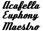
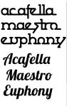
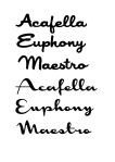

Above are a vareity of fonts that I found on ‘Dafont.com’. These are all fonts that are inspired by the style of Esquire and Rolling Stone’s mastheads, and abide to the elicit style. The fonts above are all under consideration but I, above the rest, prefer the ‘Lobster’ font.

