
The first step that I took in creating my double-page spread was selecting the photograph that I was going to use. I transferred this image to Adobe photoshop which is where I edited the image to make for a more appealing photograph.
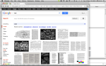
 I wanted the image to be black and white, much like the image of Lady Gaga featured in Q magazine’s double page spread (below).

Lady Gaga image
I did this because I felt that it created a more interesting and original image. It adds to the intended simplicity if my magazine; opposing the typically seen bright and vivid colours.
After deducting the colour from my photograph, I then had to make the black and white more prominent in the image. I did this by editing the brightness and the contrast of the image by going image > adjustments > brightness and contrast. I moved the arrows up and down the spectrum until I found the right tone and contrast that I thought made the image more striking without being too bright or too dark.

(Editing the contrast of the image)
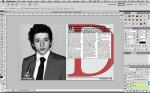
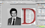
After editing the image to look equally as appealing as the image that appeared in Q magazine, I had to lay the image on a double page spread-proportioned page in order to continue the process of my DPS.

At this stage of production, I had to place the image on an A3-sized image that had a high resolution (to make for a better quality page). After placing the image on an off-white A3 page, I had to align it to the left-hand page, as this was the page that I wanted to feature a full-sized image on. The next stage was to place something on the opposite page.

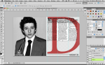
After placing the left-hand image on the right side of the page, I inserted the page number in a black font that's the same font as the masthead font. This is for consistency purposes and makes for a good magazine. I also inserted a separator (the white line) that will sit between the '23' and the words 'main feature'. This is a frequently seen feature in magazines and I think it looks modern and simplicity again benefits the magazines.
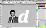
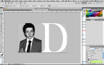
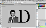
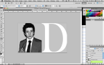
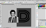
The following images are all examples of experimenting with different fonts to act as the background ‘D’ or ‘d’. I was judging them based on their consistency when regarding the recurrent theme of the magazine

-
- I have duplicated the text here, but I have not yet aligned the bottom paragraphs with the top ones.
My least favourite font is the bottom ‘Disco’ font, as it doesn’t fit in with the theme and I personally just don’t like it. The font that I prefer is the one coloured in red in the selection above, as it’s consistency within the theme and it makes for a more impacting image.

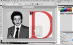
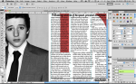
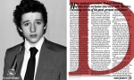
Above is the insertion of the capital letter that is going to appear as the first letter of the article’s sub-heading. I have chosen to make it the same font (Lobster) as the front cover’s masthead, as this is the theme’s font of my magazine – so I must try to keep it consistent wherever possible. Here, the juxtaposition of the red ‘D’ opposite a black & white photograph helps to illuminate both conventions of this double page spread. The page number that I inserted on the bottom corner of the bottom left, I have also inserted opposite on the right-hand side. I have also used the font ‘Lobster’ here.

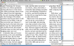
As you can see above, I have written the sub-heading which is actually more of a heading, as there’s no other heading that’s above it. This is used to briefly summarise the article that follows, so that the readers can become more intrigued and interested by the article. Now that I had started developing the text by making a text box and inserting text that isn’t related to the article, but is a sample text that I found online, which I used purely for time convenience purposes.
I would now have to duplicate the text and position it below the incumbent text so that it becomes a full page of text.

I have duplicated the text here, but I have not yet aligned the bottom paragraphs with the top ones. As the text has been duplicated, A white background has appeared behind the bottom paragraphs - this requires me to change the 'normal' setting (below 'layers' tab) to 'multiply', which filters the white our of any layer it's applied to. Here, I also have to re-align the bottom paragraphs.

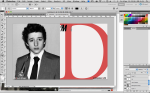
Now the entire ‘D’ is visible and I have aligned the text accordingly to the proportions of the image. In order to also compliment the proportions of the image, I have placed measure lines between the bottom of the article and the page no. and between the sub-heading and the article introduction. I have done this to add to the style and look of the double page spread, and it also adds to the consistency of the colour scheme. It was nearing completion.

The above image is what I deem to be my completed double page spread.
